The sales pitch:
This page is dedicated to all the people I’ve been encouraging to get a website.
It’s along the lines of: if I can do it, so can you.
This is my first website. I don’t have previous computer experience beyond learning how to use one. (Well, the B.A. in journalism helped.)
I’ve had e-mail fan letters from off-campus and job offers from people who found the site (I was retained as an expert witness in a near-drowning lawsuit, which the good guys won. I have been a guest lecturer at Santa Clara University and taught for Los Gatos Recreation, the Fremont Union High School District and others).
In late October 2006 the original De Anza College version of my faculty website, one of the first at De Anza, received its one millionth hit. April, 2008 it received its two millionth hit. In late 2009, the three millionth. In late 2010 it had four million hits, in late 2011 five million. In March 2016 the server was failing and I moved the faculty website here.
The History of swimming page I wrote to cover part of the curriculum for my swim classes was getting over 2,000 hits a month. Instructors at a Texas College and an eastern secondary school linked to my page on the history of swimming as homework for their students.
CSU Stanislaus linked to Oxygen Administration Quick Facts for a math project.
An online traffic school linked to a Outdoor Club page on driving in bad weather.
An English As A Second Language school in Paris, France linked to swimming vocabulary as a homework assignment.
Baylor University and Capitol City Medical Training Center linked to Common Mistakes in CPR.
Isn’t it time you got a website?
Enough sales pitch? Here are some tips:
Many people type ‘Welcome to my homepage’ or ‘Welcome to this website’ as the first line at the top of their homepage. But if a student or team member selects such a site as a ‘favorite’ the words in their list of favorites will be ‘Welcome to.’ If you write a first line that starts with your name, such as “Jane Faculty welcomes you…” then your name will be identified on their list of favorites.
If you will not have a lot of time to keep up you webpage and re-edit it every quarter, be sure to not put in dates when you don’t need to.
I first learned how to make a word blue or green or … at a website that is out of business. Try searching for HTML color codes chart.
I made a page for myself of various colors so I could see what various colors actually look like at my pages when used for text. It’s at: HTML color codes
Warning, some colors, like lime are not very readable on a white background, but purple or teal are okay if you don’t use them too much.
The first photo most of us download to our sites is of De Anza from the De Anza website, so it is the correct size. The second one I tried to move to my site more than filled the screen (actually, only a corner of it was on the screen). I had scanned it and tried to move it directly. Soon enough I learned to resize the scanned photos using Photoshop Elements. If you right click on an online photo and go to properties you can see the dimensions in pixels.
Remember, if you use too many large sized images, your page will take a long time for some people to download.
If you need an overhead photo of something for your page and the item is portable, take it to the stadium and put in on the ground at the soccer field side, then climb the bleachers and take the photo. Two examples are at: How to pitch the Cabela eight-person tent
Personally check out other recommended websites before you link to them. Many of the sites recommended in our Wellness Center ‘Instructor’s Resource Guide’ have good information, but they really exist mostly to sell some product or book. After you link, check to see that your link functions. Recheck links occasionally or just before you assign homework from them.
I’ve been pleased at how quickly most sites have responded to my email requests for permission to use photos from their websites. Some (like the National Park Service) limit which I can use, others have said it’s okay as long as they are not used for commercial purposes. Some ask for attribution, others don’t. The maker of a product said “as long as ______ and its products are portrayed in a positive light, and the _____and ____ are being recommended for their intended purposes, permission granted.”
____________________________
On August 17, 2002 I got an e-mail from the inventor of a product I had mentioned in my backpacking advice page. He let me know that the area code for a referral phone number I mentioned on the page had changed and thanked me for my good work. I imagine many people search for their products/services/names regularly to see if they are being mentioned.
![]()
____________________________
When I look at the referrals to my site I note that many people search at a search engine for the answers to Red Cross tests, or at least sample questions, so I wrote a page of the same advice I give my students before an exam. It’s at:
How to pass a Red Cross written test
and it had 8,600 hits as of June 2005, 40,000 by October 2007 and 133,000 by March 2010, 379,415 by early 2016 when the server was failing and I had to move it away from De Anza to this new website. In the first three years here it got 53,352 hits.
____________________________
___________________________________________________________
NOLO Press has a section on Internet Law.
Go to: http://www.nolo.com/legal-encyclopedia
go toto patents, copyright and click on software and web development
Some of the most important rules there are:
1. Assume Others’ Work Is Protected
3. When In Doubt, Seek Permission
and it has links to copyright collectives or clearinghouses
A Campus map is at:
https://www.deanza.edu/maps-and-tours/
You can add a link to specific quad maps at pages for each of your classes.
https://www.deanza.edu/maps-and-tours/s_quad.html
https://www.deanza.edu/maps-and-tours/l_quad.html
https://www.deanza.edu/maps-and-tours/a_quad.html
https://www.deanza.edu/maps-and-tours/pe_quad.html
According to Google: “Following these guidelines will help Google find, index, and rank your site, which is the best way to ensure you’ll be included in Google’s results.”
http://www.google.com/webmasters/guidelines.html
I’ve made a few borders like the ones here and there on this page. They can be found at:
clipart borders
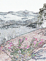
Photoshop Elements filters
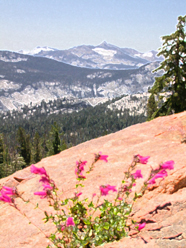
One photograph of wildflowers growing from a crack in rock using different Adobe Photoshop Elements filters.


You might also be interested in:
Student attitudes about disruptive behavior
_______________________________
Important notes from the portal about confidentiality that also apply to your website:
“Student educational records are considered confidential and may not be released to a third party without the written consent of the student.
Do not share non-directory information from a student’s education record such as grades or class schedules with parents–even if the student is under eighteen years of age. Refer the parents to the Office of Admissions and Records.”
the average professor earns more money in a year
than a professional athlete earns in a whole week.
Evan Esar (1899 – 1995)
